Hello Leaders, Welcome to Aspire SoftServ Pvt. Ltd (Formerly Aspire Software Solutions), This is the 4th part of the Tailwind CSS series.
Table of Contents
Introduction
In this article, we will look into spacing, sizing & typography in tailwind CSS in detail, with examples.
Let’s start with the prerequisites.
Prerequisites
If you are a beginner in Tailwind CSS, please follow our series as below:
The Complete Guide of TailwindCSS [ COMPLETE SERIES ]
What is Tailwind CSS
TailwindCSS is a utility-first CSS framework that makes it easy to implement popular design patterns. It is the framework that follows the Utility-First CSS methodology, which means your code can be more extensible, organized and reusable.
TailwindCSS properties Part-4 – BACKGROUND, BORDERS, TABLES
BACKGROUND in Tailwind CSS
Tailwind CSS presents background related properties like as below
1. Background Attachment
Background attachment is a utility for managing how a background image acts while scrolling.

Types of Background Attachment:1. Fixed: Use the bg-fixed class in tailwind CSS to fix the background image relative to the viewport.
Code:
<div class="bg-fixed" style="background-image: url(...)"></div>2. Local: Use the bg-local class in tailwind CSS to scroll the background image with the container & the viewport.
<div class="bg-fixed" style="background-image: url(...)"></div>3. Scroll: Use the bg-scroll class in tailwind CSS to scroll the background image similar to the viewport, without the container.
<div class="bg-scroll" style="background-image: url(...)"></div>2. Background Clip
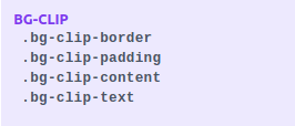
Background Clip is a utility in tailwind CSS for managing the bounding box of a UI component’s background.
Use:
Use the bg-clip-{keyword} utilities to restrict the bounding box of a UI component’s background.

Examples:
<div class="bg-clip-border p-6 bg-indigo-600 border-4 border-indigo-300 border-dashed"></div>
  <div class="bg-clip-padding p-6 bg-indigo-600 border-4 border-indigo-300 border-dashed"></div>
  <div class="bg-clip-content p-6 bg-indigo-600 border-4 border-indigo-300 border-dashed"></div>
3. Background Color
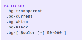
Utilities for managing a UI component’s background colour.
Types of Background color:
1. Background color
The background color is a class that restrict the background color of a UI component in tailwind CSS using the bg-{color} utilities.

Code:
<button class="bg-green-500 ...">Button</button>2. Background Opacity
Background Opacity is a utility in tailwind CSS for managing the opacity of a UI component’s background color.

Code:
<div class="bg-indigo-600 bg-opacity-100 ..."></div>
  <div class="bg-indigo-600 bg-opacity-75 ..."></div>
  <div class="bg-indigo-600 bg-opacity-50 ..."></div>
  <div class="bg-indigo-600 bg-opacity-25 ..."></div>
  <div class="bg-indigo-600 bg-opacity-0 ..."></div>
Example

3. Background Origin
Utilities for managing how a UI component’s background is positioned relative to borders, content, and padding.

Usage:
Use bg-origin-border, bg-origin-padding, & bg-origin-content in Tailwind CSS to control where a UI component’s background is rendered.
Code
<div class="bg-origin-border p-4 border-4 border-dashed" style="background-image: url(...)">1</div>
  <div class="bg-origin-padding p-4 border-4 border-dashed" style="background-image: url(...)">2</div>
  <div class="bg-origin-content p-4 border-4 border-dashed " style="background-image: url(...)">3</div>
Example

4. Background Position
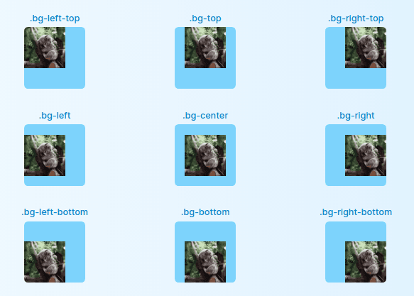
Background Position is a utility for managing the position of a component’s background image.
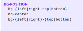
Code:
<div class="bg-no-repeat bg-left-top ..." style="background-image: url(...);"></div>
  <div class="bg-no-repeat bg-top ..." style="background-image: url(...);"></div>
  <div class="bg-no-repeat bg-right-top ..." style="background-image: url(...);"></div>
  <div class="bg-no-repeat bg-left ..." style="background-image: url(...);"></div>
  <div class="bg-no-repeat bg-center ..." style="background-image: url(...);"></div>
  <div class="bg-no-repeat bg-right ..." style="background-image: url(...);"></div>
  <div class="bg-no-repeat bg-left-bottom ..." style="background-image: url(...);"></div>
  <div class="bg-no-repeat bg-bottom ..." style="background-image: url(...);"></div>
  <div class="bg-no-repeat bg-right-bottom ..." style="background-image: url(...);"></div>
Example:
5. Background Repeat
Background Repeat is a utility in Tailwind CSS for managing the repetition of a UI component’s background image.
This property is used to manage the iteration of background images. Tailwindcss offers classes as below.
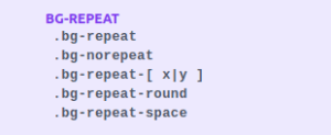
Code:
<div class="bg-repeat ..." style="background-image: url(...)"></div>
  <div class="bg-norepeat ..." style="background-image: url(...)">  </div>
  <div class="bg-repeat-x bg-center  ..." style="background-image: url(...)"></div>
  <div class="bg-repeat-y bg-center  ..." style="background-image: url(...)">
</div>
Example:

6. Background Size
Utilities for managing the background size of a UI component’s background image.

Code:
<div class="bg-auto bg-no-repeat bg-center ..." style="background-image: url(...)"></div>
  <div class="bg-cover bg-no-repeat bg-center ..." style="background-image: url(...)"></div>
  <div class="bg-main bg-no-repeat bg-center ..." style="background-image: url(...)"></div>
7. Background Image
Utilities for managing a UI component’s background image.
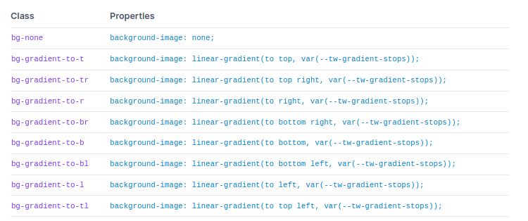
Code:
<div class="bg-gradient-to-r from-yellow-400 via-red-500 to-pink-500 ...">
</div>
Example:

8. Gradient Color Stops
Gradient Color Stops is a utility for managing the color stops in background gradients in Tailwind CSS.
Examples of Gradient Color Stops:
1. Starting color
Set the starting color class of a gradient in tailwind CSS using the from-{color} class utilities.
<div class="bg-gradient-to-r from-red-500 ..."></div>2. Ending color
Set the ending color class of a gradient in tailwind CSS using the to-{color} class utilities.
<div class="bg-gradient-to-r from-green-400 to-blue-500 ..."></div>‘Gradients to’ don’t fade in from transparent by default. To fade in from transparent, first, reverse the gradient direction & use a from-{color} utility.
3. Middle color
The middle color is a class that enhances a middle color to a gradient in tailwind CSS using the via-{color} utilities.
<div class="bg-gradient-to-r from-purple-400 via-pink-500 to-red-500 ..."></div>Gradients with a from-{color} & via-{color} in tailwind CSS will fade out to transparent by default if no to-{color} is present.
Examples of Starting, Middle & Ending color gradients:
<div class="container mx-auto px-4">
     <h2 class="text-gray-800 font-extrabold"> STARTING COLOR - USING from-{color}</h2>
     <div class="w-full h-20 bg-gradient-to-r from-red-500"></div>
     <br />
     <h2 class="text-gray-800 font-extrabold"> ENDING COLOR - USING to-{color}</h2>
     <div class="w-full h-20 bg-gradient-to-r from-green-400 to-blue-500"></div>
     <br />
     <h2 class="text-gray-800 font-extrabold"> MIDDLE COLOR - USING via-{color}</h2>
     <div class="w-full h-20 bg-gradient-to-r from-purple-400 via-pink-500 to-red-500"></div>
     <br />
  </div>

4. Fading to transparent
Fading to transparent Gradients is fade out to transparent by default in tailwind CSS, without requiring you to add to-transparent explicitly.
BORDERS in Tailwind CSS
Border Radius
Border radius is a utility in tailwind CSS for managing the border-radius of a UI component.
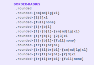
Code:
<div class="container mx-auto px-4 flex flex-row space-x-4">
     <div class="rounded-sm p-6 bg-blue-500 py-6 w-36 text-white border-black border-2">.rounded-sm</div>
     <div class="rounded p-6 bg-blue-500 py-6 w-36 text-white border-black border-2">.rounded</div>
     <div class="rounded-md p-6 bg-blue-500 py-6 w-36 text-white border-black border-2">.rounded-md</div>
     <div class="rounded-lg p-6 bg-blue-500 py-6 w-36 text-white border-black border-2">.rounded-lg</div>
     <br/>
     <div class="rounded-none p-6 bg-blue-500 py-6 w-36 text-white border-black border-2">.rounded-none</div>
     <div class="rounded-full py-3 px-6 bg-blue-500 text-white flex justify-center border-black border-2">Circle</div>
     <br/>
     <div class="rounded-t-lg p-6 bg-blue-500 py-6 w-36 text-white border-black border-2">.rounded-t-lg</div>
     <div class="rounded-r-lg p-6 bg-blue-500 py-6 w-36 text-white border-black border-2">.rounded-r-lg</div>
     <div class="rounded-b-lg p-6 bg-blue-500 py-6 w-36 text-white border-black border-2">.rounded-b-lg</div>
     <div class="rounded-l-lg p-6 bg-blue-500 py-6 w-36 text-white border-black border-2">.rounded-l-lg</div>
  </div>
Example:

Border Width
Utilities for managing the width of a UI component’s borders.

Code:
<div class="border-0 border-indigo-600 ..."></div>
  <div class="border border-indigo-600 ..."></div>
  <div class="border-2 border-indigo-600 ..."></div>
  <div class="border-4 border-indigo-600 ..."></div>
  <div class="border-8 border-indigo-600 ..."></div>
Example:

Border Color
Utilities for managing the color of a UI component’s borders.
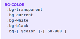
Code:
<input class="border-2 border-blue-500 ...">Example:

Read more about border-color in tailwind CSS documentation.
Border Opacity
Utilities for managing the opacity of a UI component’s border color.

Code:
<div class="border-4 border-light-blue-500 border-opacity-100 ..."></div>
  <div class="border-4 border-light-blue-500 border-opacity-75 ..."></div>
  <div class="border-4 border-light-blue-500 border-opacity-50 ..."></div>
  <div class="border-4 border-light-blue-500 border-opacity-25 ..."></div>
  <div class="border-4 border-light-blue-500 border-opacity-0 ..."></div>
Example:

Border Style
Border Style is a utility in tailwind CSS for managing the style of a UI component’s borders.
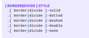
Code:
<div class="border-solid border-4 border-light-blue-500 ..."></div>
  <div class="border-dashed border-4 border-light-blue-500 ..."></div>
  <div class="border-dotted border-4 border-light-blue-500 ..."></div>
  <div class="border-double border-4 border-light-blue-500 ..."></div>
  <div class="border-none border-4 border-light-blue-500 ..."></div>
Example:

Divide Width
Utilities for managing the border width between UI components.
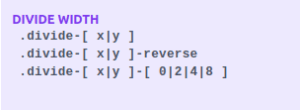
Code:
<p> divide-x </p>
  <div class="grid grid-cols-3 divide-x divide-green-500">
     <div>1</div>
     <div>2</div>
     <div>3</div>
  </div>
  <p> divide-y </p>
  <div class="grid grid-cols-1 divide-y divide-yellow-500">
     <div>1</div>
     <div>2</div>
     <div>3</div>
  </div>
  <p> divide-y-reverse </p>
  <div class="flex flex-col-reverse divide-y divide-y-reverse divide-rose-400">
     <div>1</div>
     <div>2</div>
     <div>3</div>
  </div>
Example:
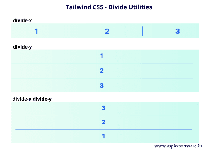
N.B: Read more about Divide Color, Divide Opacity and Divide Style in the documentation.
Ring
Ring Width
Utilities for creating outline rings with box shadows.

Code:
<button class="... ring-0">ring-0</button>
  <button class="... ring-2">ring-2</button>
  <button class="... ring">ring</button>
  <button class="... ring-4">ring-4</button>
Example:

Ring Color
Ring Color is a utility in tailwind CSS for setting the color of outline rings.
.[ring]-transparent
.[ring|-current
.[ring]-white
.[ring]-black
.[ring]-{$color}-{50-900}
Code:
<button class="... ring-4 ring-indigo-300">
    Button
  </button>
Example:

Ring Opacity
Ring Opacity is a utility in tailwind CSS for setting the opacity of outline rings.
[RING ]-OPACITY
.[ ring ]-opacity-[ $opacity ]
Code:
<button class="... ring-4 ring-red-500 ring-opacity-50">
    Button
  </button>
Example:

Ring Offset Width
Ring Offset Width is a utility in tailwind CSS for simulating an offset while adding outline rings.

Code:
<button class="... ring ring-pink-600 ring-offset-0">ring-0</button>
  <button class="... ring ring-pink-600 ring-offset-2">ring-2</button>
  <button class="... ring ring-pink-600 ring-offset-4">ring-4</button>
Example:

Ring Offset Color
Ring Offset Color is a utility in tailwind CSS for setting the color of the outline ring offsets.
Code:
<p class="font-semibold text-blue-600"> bg-purple-100</p>
  <div class="... bg-blue-100">
     <button class="... ring ring-blue-600 ring-offset-4 ring-offset-blue-100">
     ring-offset-blue-100
     </button>
  </div>
Example:

TABLES
Border Collapse
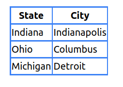
Border Collapse is a utility in tailwind CSS for managing if table borders should collapse or be separated

Border-collapse:
border-collapse is used to join adjacent cell borders into one single border while possible. Note that this contains collapsing borders on the top-level <table> tag.
Code:
<table class="border-collapse border border-green-800 ...">
  ----
</table>Example:
Border-separate:
border-separate is used to force each cell to display its separate borders.
Code:
<table class="border-separate border border-green-800 ...">
  ----
  </table>
Example:
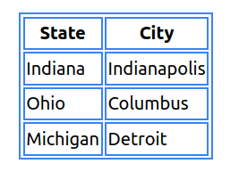
Table Layout
Table Layout is a utility by Tailwind CSS for managing the table layout algorithm.

1. table-auto:
Table-auto is used in tailwind CSS to enable the table to automatically size columns to fit the contents of the cell.
Code:
<div class="container mx-auto p-8">
     <table class="table-fixed border-2 border-blue-500">
        <thead>
           <tr>
              <th class="border-2 border-blue-500">No</th>
              <th class="border-2 border-blue-500">BookName</th>
              <th class="border-2 border-blue-500">Edition</th>
           </tr>
        </thead>
        <tbody>
           <tr>
              <td class="border-2 border-blue-500">1</td>
              <td class="w-1/4 border-2 border-blue-500">JavaScript -The Complete Reference Book - O'Reilly The Complete Reference
                 Book - O'Reilly The Complete Reference Book - O'Reilly
              </td>
              <td class="border-2 border-blue-500">7th</td>
           </tr>
           <tr>
              <td class="border-2 border-blue-500">2</td>
              <td class="w-1/4 border-2 border-blue-500">Java</td>
              <td class="border-2 border-blue-500">11th</td>
           </tr>
           <tr>
              <td class="border-2 border-blue-500">3</td>
              <td class="w-1/4 border-2 border-blue-500">Liferay</td>
              <td class="border-2 border-blue-500">10th</td>
           </tr>
        </tbody>
     </table>
  </div>
Example:

2. table-fixed:
Table-fixed is used as table-fixed to allow the table to ignore the content & use fixed widths for columns.
Note: You can manually set the widths for some columns & the rest of the available width will be divided evenly amongst the columns without specific width.
Code:
<table class="table-fixed">
     ------
  </table>
Example:

Conclusion
We've covered all the fantastic features of Tailwind CSS, from backgrounds to borders and tables. For a comprehensive understanding, we recommend exploring the complete Tailwind CSS series in order.
Save this post for quick access and use it as a handy reference guide. Follow the official documentation for any configuration-related tweaks during your projects.
The most effective way to learn is through hands-on experience. Dive into each section, practice, and bookmark for easy reference. And, of course, share this valuable resource with your colleagues and friends on social media like Facebook and LinkedIn.
Ready to elevate your web development game? Contact us and let's discuss how we can assist you in implementing Tailwind CSS in your projects!

