Hello Leaders, Welcome to Aspire SoftServ Pvt. Ltd (Formerly Aspire Software Solutions), This is the 3rd part of the Tailwind CSS series.
Table of Contents
Introduction
Let’s start with the prerequisites.
Prerequisites
If you are new to Tailwind CSS, please read our series as follows:
The Ultimate Guide of TailwindCSS [ COMPLETE SERIES ]
What is Tailwind CSS
TailwindCSS is a utility-first CSS framework that creates it easy to implement popular design patterns. It is also the only framework that follows the Utility-First CSS methodology, which means your code can be more organized, reusable and extensible.
TailwindCSS properties Part-3 – SPACING, SIZING & TYPOGRAPHY
In this article, we will look into spacing, sizing and typography in tailwind CSS in detail, with examples.
SPACING:
Spacing in tailwind CSS is more compact and comfortable to implement in HTML compared to traditional CSS. In tailwindcss, padding, margin and space-between are included as below. Let’s see each topic in-depth.
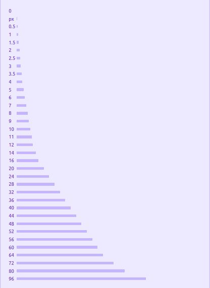
Below is a list of classes postfixes are used in the margin, padding, and spacing.
For Example:
- For Margin: m-1,mx-0.5, my-16
- For Padding: p-1,px-0.5, py-16
- For Space-between: m-1,mx-0.5, my-16
1. Padding
Utilities for managing a UI Component’s padding.
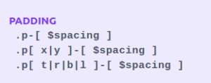
Types of Padding:
1. Add Single Side padding
Use pr-n, pl-n, pt-n, pb-n respectively right, left, top, bottom padding for one side. N is here number you can refer to above image or documentation.
Snippet:
<div class="pt-6 ...">pt-6</div>
    <div class="pr-4 ...">pr-4</div>
    <div class="pb-8 ...">pb-8</div>
    <div class="pl-2 ...">pl-2</div>
2. Add horizontal padding
Manage the horizontal padding of a UI Component using the px-{size} utilities.
<div class="px-8 ...">px-8</div>3. Add vertical padding
Manage the vertical padding of a UI Component using the py-{size} utilities.
<div class="py-8 ...">py-8</div>4. Add padding to all sides
Manage the padding on all sides of a UI Component using the p-{size} utilities.
<div class="p-8 ...">p-8</div>2. Margin
Margin in tailwind CSS is a utility for managing a UI Component’s margin.
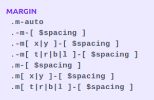
Types of Margin:
1. Add margin to a single side
In tailwind CSS, you can add the margin on one side of a UI Component using the m{t|r|b|l}-{size} utilities.
For example:
<div class="mt-8 ...">mt-8</div>
    <div class="mr-8 ...">mr-8</div>
    <div class="mb-8 ...">mb-8</div>
    <div class="ml-8 ...">ml-8</div>
2. Add horizontal margin
Manage the horizontal margin of a UI Component using the mx-{size} utilities.
<div class="mx-8 ...">mx-8</div>3. Add vertical margin
Manage the vertical margin of a UI Component using the ‘my-{size}’ utilities.
<div class="my-8 ...">my-8</div>4. Add margin to all sides
Manage the margin on all sides of a UI Component using the ‘m-{size}’ utilities.
<div class="w-32 h-16 bg-fuchsia-300 ..."></div>
    <div class="-mt-8 bg-fuchsia-500 ...">-mt-8</div>
3. Space Between
Utilities for managing the space between child UI Components.
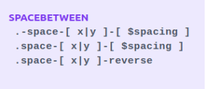
Types of Space-between:
1. Add horizontal space between children
Manage the horizontal space between UI Components using the space-x-{amount} utilities.
<div class="flex space-x-4 ...">
       <div>1</div>
       <div>2</div>
       <div>3</div>
    </div>
2. Add vertical space between children
Manage the vertical space between UI Components using the space-y-{amount} utilities.
<div class="flex space-y-4 ...">
       <div>1</div>
       <div>2</div>
       <div>3</div>
    </div>
3. Reversing children orderIf your UI Components are in reverse order (using say flex-row-reverse or flex-col-reverse), use the space-x-reverse or space-y-reverse utilities to ensure the space is added to the correct side of each UI Component.
<div class="flex flex-row-reverse space-x-4 space-x-reverse ...">
       <div>1</div>
       <div>2</div>
       <div>3</div>
    </div>
Note: For those situations, it’s better to use the gap utilities when possible, or add margin to every UI Component with a matching negative margin on the parent:
<div class="flow-root">
       <div class="-m-2 flex flex-wrap">
          <div class="m-2 ..."></div>
          <div class="m-2 ..."></div>
          <div class="m-2 ..."></div>
       </div>
    </div>
SIZING
Tailwind’s Sizing includes the following main properties which are as below
- Width
- Min Width
- Max Width
- Height
- Min Height
- Max Height
1. Width
Utilities for setting the width of a UI Component.
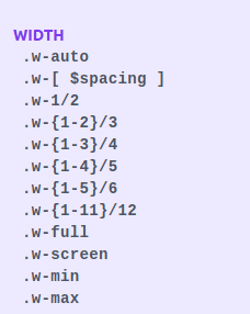
Properties of Width:
1. Auto
W-auto in tailwind CSS property is useful to let the browser calculate and choose the required width for the UI Component. It is also useful to unset a particular width
<div class="w-24 md:w-auto ..."></div>2. Screen Width:
Use w-screen to create a UI Component that spans the entire width of the viewport.
<div class="h-12 w-screen"></div>3. Fixed Width
Fixed Width allows in tailwind CSS such as w-{number} or w-px to apply fixed width to a UI Component.
<div>
       <div class="w-8 ..."></div>
       <div class="w-12 ..."></div>
       <div class="w-16 ..."></div>
       <div class="w-24 ..."></div>
    </div>
4. Fluid Width
Use w-{fraction} or w-full to set a UI Component to a percentage-based width.
<div class="flex ...">
       <div class="w-1/2 ... ">w-1/2</div>
       <div class="w-1/2 ... ">w-1/2</div>
    </div>
    <div class="flex ...">
       <div class="w-2/5 ...">w-2/5</div>
       <div class="w-3/5 ...">w-3/5</div>
    </div>
    <div class="flex ...">
       <div class="w-1/3 ...">w-1/3</div>
       <div class="w-2/3 ...">w-2/3</div>
    </div>
    <div class="flex ...">
       <div class="w-1/4 ...">w-1/4</div>
       <div class="w-3/4 ...">w-3/4</div>
    </div>
    <div class="flex ...">
       <div class="w-1/5 ...">w-1/5</div>
       <div class="w-4/5 ...">w-4/5</div>
    </div>
    <div class="flex ...">
       <div class="w-1/6 ...">w-1/6</div>
       <div class="w-5/6 ...">w-5/6</div>
    </div>
    <div class="w-full ...">w-full</div>
2. Min-Width
Utilities for setting the minimum width of a UI Component

Usage
For minimum width in tailwind CSS, the min-w-0 or min-w-full utilities are useful to apply on a UI Component using.
For Example:
<div class="w-24 min-w-full ...">
       min-w-full
    </div>
3. Max-Width
Utilities for setting the maximum width of a UI Component
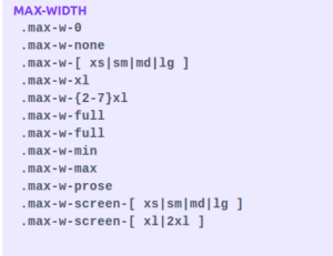
Usage:
Set the maximum width of a UI Component using the max-w-{size} utilities.
Code:
<div class="max-w-md mx-auto ...">
      <!-- ,,, --->
    </div>
4. Height
Utilities for setting the height of a UI Component.
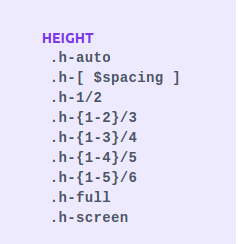
Properties of Height:
1. Auto
H-auto class allows the browser to identify the height of the UI Component.
<div class="h-auto ...">
      h-auto
    </div>
2. Screen height
For screen height, h-screen in tailwind CSS is useful to create a UI Component that spans the entire height of the viewport.
<div class="h-screen p-6 ...">
      h-screen
    </div>
3. Fixed height
For Fixed height, h-{number} or h-px in tailwind CSS is useful to set a UI Component to a fixed height.
<div>
       <div class="h-8 ..."></div>
       <div class="h-12 ..."></div>
       <div class="h-16 ..."></div>
       <div class="h-24 ..."></div>
    </div>
4. Full height
For Full-height, the h-full class in tailwind CSS allows setting a UI Component’s height to 100% of its parent, along with the parent has a defined height.
<div class="h-48>
       <div class="h-full ...">h-full</div>
    </div>
5. Min-Height
Utilities for setting the minimum height of a UI Component

Usage
min-h-0, min-h-full, or min-h-screen utilities are useful for the minimum height of a UI Component.
Code:
<div class="h-48 ...">
       <div class="h-24 min-h-full ...">
          .min-h-full
       </div>
    </div>
6. Max-Height
Max-Height utilities allow for applying the maximum height of a UI Component.
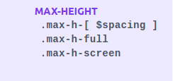
Code:
<div class="h-24 ...">
       <div class="h-48 max-h-full ...">
          .max-h-full
       </div>
    </div>
For example, max-h-full or max-h-screen utilities are useful to Set the maximum height of a UI Component.

TYPOGRAPHY
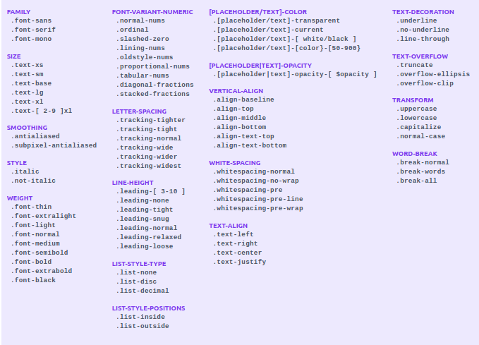
1. Font Family
Font Family utilities allow in tailwind CSS to control the font family series of a UI Component.
| Class | Properties |
|---|---|
| font-sans |
font-family: ui-sans-serif, system-ui, "Segoe UI", Roboto,
-apple-system, BlinkMacSystemFont , Arial, "Helvetica Neue", sans-serif, "Noto Sans", "Apple Color Emoji","Segoe UI Emoji", "Segoe UI Symbol", "Noto Color Emoji"; |
| font-serif | font-family: ui-serif, Georgia, Cambria, "Times New Roman", Times, serif; |
| font-mono |
font-family: ui-monospace, SFMono-Regular, Menlo, Monaco, Consolas,
"Liberation Mono", "Courier New", monospace; |
Types of Font Family:
1. Sans-serif
For Sans-serif in tailwind CSS, font-sans class is useful to apply a web-safe sans-serif font-family:
<p class="font-sans ...">
       The quick brown fox jumps over the lazy dog.
    </p>
Example:

2. Serif
font-serif utility in tailwind CSS is useful to apply a websafe serif font-family:
<p class="font-serif ...">
       The quick brown fox jumps over the lazy dog.
    </p>
Example:

3. Monospaced
Monospaced as font-mono in tailwind CSS is useful to apply a web-safe ‘monospaced’ font-family:
<p class="font-mono ...">
       The quick brown fox jumps over the lazy dog.
    </p>
Example:

2. Font Size
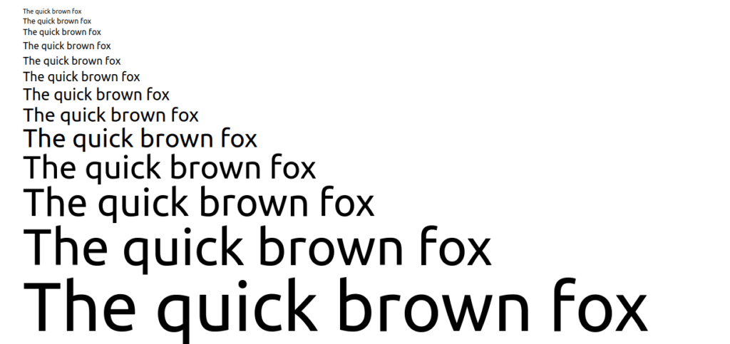
Manage the font size of a UI Component using the text-{size} utilities.
Code:
<div class="container mx-auto px-4">
       <p class="text-xs ">The quick brown fox </p>
       <p class="text-sm ">The quick brown fox </p>
       <p class="text-base ">The quick brown fox </p>
       <p class="text-lg ">The quick brown fox </p>
       <p class="text-xl ">The quick brown fox </p>
       <p class="text-2xl ">The quick brown fox </p>
       <p class="text-3xl ">The quick brown fox </p>
       <p class="text-4xl ">The quick brown fox </p>
       <p class="text-5xl ">The quick brown fox </p>
       <p class="text-6xl ">The quick brown fox </p>
       <p class="text-7xl ">The quick brown fox </p>
       <p class="text-8xl ">The quick brown fox </p>
       <p class="text-9xl ">The quick brown fox </p>
    </div>
Example:
3. Font Smoothing
Font Smoothing utilities allow for managing the font smoothing of a UI Component.

Types of Font Smoothing:
Subpixel Antialiased
‘subpixel-antialiased’ utility in tailwind CSS is useful to render text using subpixel antialiasing.
<p class="subpixel-antialiased ...">
       The quick brown fox …
    </p>
Example:

Grayscale Antialiasing
antialiased utility in tailwind CSS allows rendering text using grayscale antialiasing.
<p class="antialiased ...">
       The quick brown fox …
    </p>
Example:

4. Font Style
Font Style utilities allow controlling the style of text in tailwind CSS.
1. italic: font-style: italic;
2. not-italic: font-style: normal
Read more – Font-style
5. Font Weight
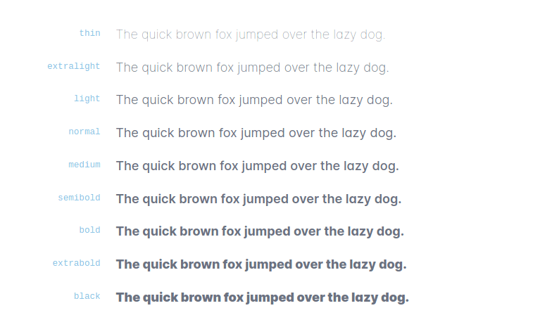
Font Weight utilities allow you to control the font-weight of a UI Component in tailwind CSS.
Snippet:
<div class=”container mx-auto px-4″>
       <p class="font-thin ...">The quick brown fox ...</p>
       <p class="font-extralight ...">The quick brown fox ...</p>
       <p class="font-light ...">The quick brown fox ...</p>
       <p class="font-normal ...">The quick brown fox ...</p>
       <p class="font-medium ...">The quick brown fox ...</p>
       <p class="font-semibold ...">The quick brown fox ...</p>
       <p class="font-bold ...">The quick brown fox ...</p>
       <p class="font-extrabold ...">The quick brown fox ...</p>
       <p class="font-black ...">The quick brown fox ...</p>
    </div>
Example:
You can learn more about properties on tailwind CSS documentation
Conclusion
Let’s conclude, This post covered all the Tailwind CSS features like layout and customization. We recommended following the complete series in sequential order for better understanding.
You can bookmark this for better understanding and quick reference. You can use documentation to understand any configuration related changes when you work on any project.
It is recommended to go through each section practically, do the practical and bookmark tab. Also, Don’t forget to share with friends, colleagues on social media. For further inquiries or assistance, feel free to Contact us .

