Hello Leaders, Welcome to Aspire SoftServ Pvt. Ltd (Formerly known as Aspire Software Solutions), We are introducing the Tailwind CSS series. This is the 2nd part of Tailwind CSS series.
Table of Contents
Introduction
Before you continue to read, we recommend that you read TailwindCSS Properties Part-1 Configuration AND Layout.
What is Tailwind CSS
TailwindCSS is a utility-first CSS framework that makes it easy to implement popular design patterns
|Read more – If you are a beginner in Tailwind CSS, please follow our series as below:
The Ultimate Guide of TailwindCSS [ 5+ Blogs ]
In this article, we are going to learn a new topic: Flexbox and Grid. Tailwind CSS offers better grid and flex utilities than bootstrap. Tailwind CSS focuses on writing zero or less CSS and provides rapid development.
Let’s see Flexbox and Grid in Tailwind CSS as below.
FLEXBOX
Let’s see Flexbox in tailwind css
1. Flex Direction
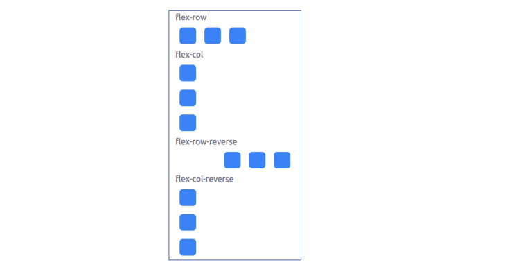
Utilities to control the direction of flex items. Flex-direction contains row and column as below

1.1.flex-row:
Flex-row in tailwind CSS makes flex items horizontally aligned in the same direction as text.
1.2. flex-row-reverse:
Flex-row-reverse in tailwind CSS makes flex items flow in reverse order. For example, if an item is the first child of a flex container, it will be on the right side instead of the left.
1.3: flex-col:
Flex-col in tailwind CSS makes flex-items flow into position flex items vertically.
1.4: flex-col-reverse:
flex-col-reverse in tailwind CSS allows flex items to position vertically in the reverse order.
Code
<div class="container border-blue-900 border w-64 px-3 my-8 py-0 mx-auto">
       flex-row
       <div class="flex flex-row">
          <div class="w-8 h-8 p-2 m-2 rounded-md  bg-blue-500"> </div>
          <div class="w-8 h-8 p-2 m-2 rounded-md  bg-blue-500"> </div>
          <div class="w-8 h-8 p-2 m-2 rounded-md  bg-blue-500"> </div>
       </div>
       flex-col
       <div class="flex flex-col">
          <div class="w-8 h-8 p-2 m-2 rounded-md  bg-blue-500"> </div>
          <div class="w-8 h-8 p-2 m-2 rounded-md  bg-blue-500"> </div>
          <div class="w-8 h-8 p-2 m-2 rounded-md  bg-blue-500"> </div>
       </div>
       flex-row-reverse
       <div class="flex flex-row-reverse">
          <div class="w-8 h-8 p-2 m-2 rounded-md  bg-blue-500"> </div>
          <div class="w-8 h-8 p-2 m-2 rounded-md  bg-blue-500"> </div>
          <div class="w-8 h-8 p-2 m-2 rounded-md  bg-blue-500"> </div>
       </div>
       flex-col-reverse
       <div class="flex flex-col-reverse">
          <div class="w-8 h-8 p-2 m-2 rounded-md  bg-blue-500"> </div>
          <div class="w-8 h-8 p-2 m-2 rounded-md  bg-blue-500"> </div>
          <div class="w-8 h-8 p-2 m-2 rounded-md  bg-blue-500"> </div>
       </div>
    </div>
    </div>

2. Flex Wrap
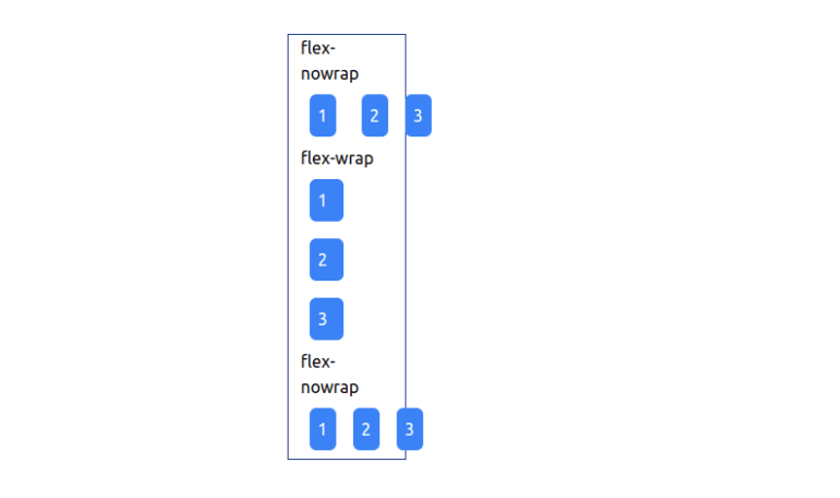
Flex Wrap is a utility to allow for managing how flex items wrap.
Flex-nowrap: flex-nowrap class allows restriction of the flex items from wrapping, affecting inflexible items to overflow the container if required.
Flex-wrap: flex-wrap class allows to wrap the flex items.
Flex-wrap-reverse: flex-wrap-reverse class allows to wrap flex items in the reverse direction.
Code:
<div class="flex flex-wrap">
       <div class="w-8 p-2 m-2 rounded-md text-white bg-blue-500">1</div>
       <div class="w-8 p-2 m-2 rounded-md text-white bg-blue-500">2</div>
       <div class="w-8 p-2 m-2 rounded-md text-white bg-blue-500">3</div>
    </div>
Example
3. Flex
Flex is a utility in tailwind CSS for controlling both grow and sink of flex items.

Flex-initial:
With flex-initial, you can set the initial size of a flex item to be whatever you want. This is very useful for making sure that your design doesn’t stretch too far and hit the browser’s side margins.
Flex-1: flex-1 set flex item in browser to grow and shrink as required, neglecting its initial.
Flex-auto: flex-auto sets a flex item to automatically grow and shrink as required in the browser.
Flex-none: flex-none allows flex items to restrict from growing or shrinking.
Code:
<div class="flex flex-wrap/flex-nowrap/flex-wrap-reverse">
       <div class="w-8 p-2 m-2 rounded-md text-white  bg-blue-500">1</div>
       <div class="w-8 p-2 m-2 rounded-md text-white  bg-blue-500">2</div>
       <div class="w-8 p-2 m-2 rounded-md text-white  bg-blue-500">3</div>
    </div>
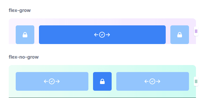
4. Flex Grow
Flex Grow property in tailwind CSS is a utility for controlling the growth of flex items.

Flex-grow: flex-grow class allows a flex item to grow to fill any conceivable space.
Flex-grow-0: flex-grow-0 class allows to restrict a flex item from growing.
Code:
<div class="flex ...">
       <div class="flex-grow h-16 ...">
          <!-- This item will grow -->
       </div>
       <div class="flex-grow-0 h-16 ...">
          <!-- This item will not grow -->
       </div>
       <div class="flex-grow h-16 ...">
          <!-- This item will grow -->
       </div>
    </div>
Example:
5. Flex Shrink
Flex Shrink is a utility in tailwind CSS for controlling the shrinking of flex items.

Flex-shrink: flex-shrink to provide a flex item to shrink if required:
Flex-shrink-0: flex-shrink-0 provide to restrict a flex item from shrinking
Code:
<div class="flex ...">
       <div class="flex-1 h-16 ...">
          <!-- This item will grow or shrink as needed -->
       </div>
       <div class="flex-shrink-0 h-16 w-32 ...">
          <!-- This element will not shrink below its default size-->
       </div>
       <div class="flex-1 h-16 ...">
          <!-- This item will grow or shrink as needed -->
       </div>
    </div>
Example:

6. Order
Orde is a utility for managing the order of flex items and grid items.
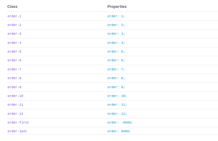
Order: order-{order} class should apply to render flex and grid items in a different order than they appear in the DOM.
Code:
<div class="flex justify-between ...">
       <div class="order-last">1</div>
       <div>2</div>
       <div>3</div>
    </div>
Example:

GRID
Grid Template Columns
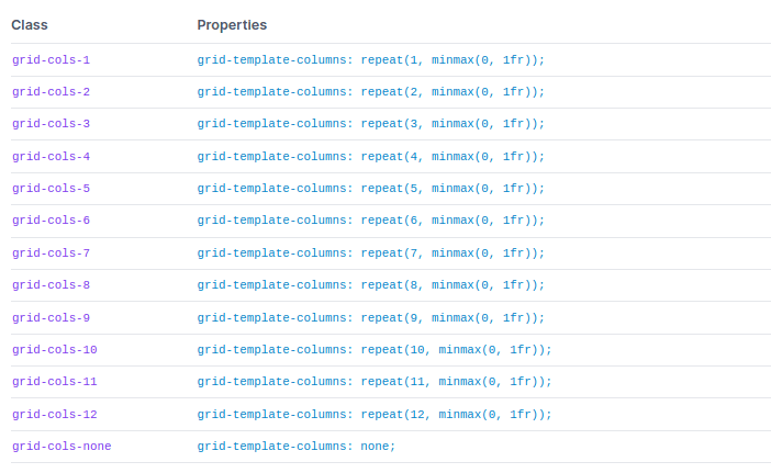
Grid Template Columns is a utility in tailwind CSS for specifying the columns in a grid arrangement.
Usage:
The grid-cols-{n} utility in tailwind CSS is useful to create grids with n(n means number) equally sized columns.
Example:
<div class="grid grid-cols-3 gap-4">
       <div>1</div>
       <!-- ... -->
       <div>9</div>
    </div>
Grid Column Start / End
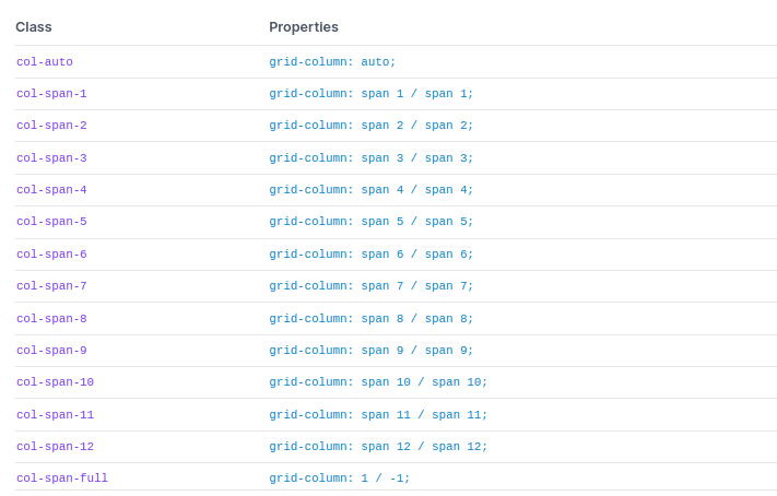
Grid Column Start / End utilities allow controlling how components are sized & placed across grid columns.
Spanning columns
Use the col-span-{n} is a utility in tailwind CSS to create an element span n columns.

Code:
<div class="grid grid-cols-3 gap-4">
       <div class="...">1</div>
       <div class="...">2</div>
       <div class="...">3</div>
       <div class="col-span-2 ...">4</div>
       <div class="...">5</div>
       <div class="...">6</div>
       <div class="col-span-2 ...">7</div>
    </div>
Grid Template Rows
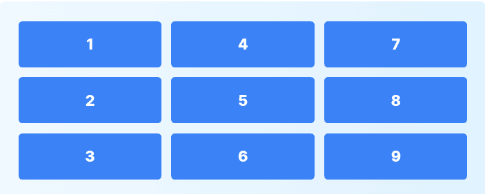
Grid Template Rows utilities allow identifying the rows in a grid layout in tailwind CSS.

Usage:
grid-rows-{n} utility allows creating grids with n same sized rows in tailwind CSS.
Code:
<div class="h-64 grid grid-rows-3 grid-flow-col gap-4">
       <div>1</div>
       -----
       <div>9</div>
    </div>
Example:
Grid Row Start / End
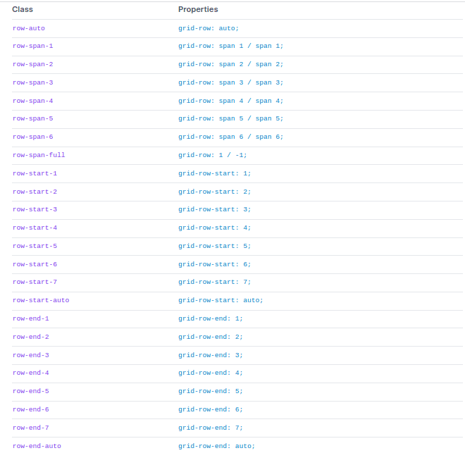
In the Grid in Tailwind CSS, You can create basic to advanced structures using the grid. Utilities for controlling the size & placement of the elements across grid rows.
Usage:
1. Spanning rows
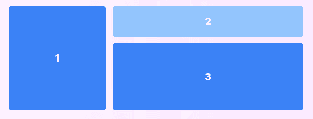
Spanning rows should use the row-span-{n} utilities in tailwind CSS to create an element span and rows.
Code:
<div class="grid grid-rows-3 grid-flow-col gap-4">
       <div class="row-span-3 ...">1</div>
       <div class="col-span-2 ...">2</div>
       <div class="row-span-2 col-span-2 ...">3</div>
    </div>
Example:
2. Starting and ending lines
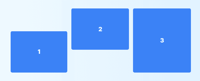
In tailwind CSS, The row-start-{n} and row-end-{n} utility classes create an element start/end at the nth grid line. These can also be combined with the row-span-{n} utilities to span a specific number of rows.
Code:
<div class="grid grid-rows-3 grid-flow-col gap-4">
       <div class="row-start-2 row-span-2 ...">1</div>
       <div class="row-end-3 row-span-2 ...">2</div>
       <div class="row-start-1 row-end-4 ...">3</div>
    </div>
Example:
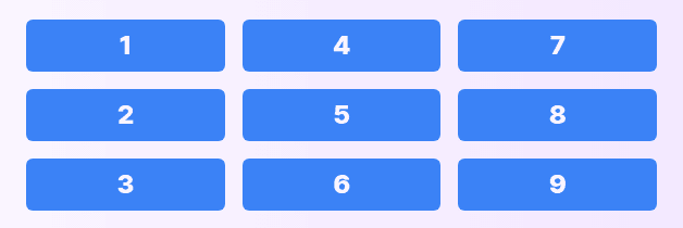
Grid Auto Flow
Grid Auto Flow Utilities use for controlling the auto-placement behaviour of elements in a grid.

Code:
<div class="grid grid-flow-col grid-cols-3 grid-rows-3 gap-4">
       <div>1</div>
       <!-- ... -->
       <div>9</div>
    </div>
Example:
Grid Auto Columns
Grid Auto columns utility allows control of the size of implicitly-created grid columns.

Code:
<div class="grid grid-flow-col auto-cols-max">
       <div>1</div>
       <div>2</div>
       <div>3</div>
    </div>
Grid Auto Rows
Grid Auto Rows Utilities to control the size of implicitly created grid rows.

Code:
<div class="grid grid-flow-row auto-row-max">
       <div>1</div>
       <div>2</div>
       <div>3</div>
    </div>
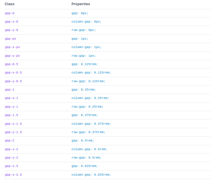
Gap
Utilities to control gutters between grid and flexbox items.
Code:
<div class="grid gap-4 grid-cols-2">
       <div>1</div>
       <div>2</div>
       <div>3</div>
   <div>4</div>
    </div>
Example:

Justify Content
Justify Content Utilities allow to control how flex and grid items are aligned along a container’s main axis.

Properties of Justify Content
1. Start: justify-start utility allows to justify items against the start of the container’s main axis.
Code:
<div class="flex justify-start ...">
       <div>1</div>
       <div>2</div>
       <div>3</div>
    </div>
Example:

2. Center: justify-center utility allows to justify items along the center of the container’s main axis:
Code:
<div class="flex justify-center ...">
       <div>1</div>
       <div>2</div>
       <div>3</div>
    </div>
Example:

Note: For more properties like space-end, space-between, space-around and space evenly, you can visit official documentation- justify-content.
Justify Items
Justify Items utilities allows to manage how grid items are aligned along their inline axis.

Properties of Justify-items in Tailwind CSS:
1. Start:
justify-items-start allows to justify grid items against the start of its inline axis:
Code:
<div class="grid justify-items-start ...">
       <div>1</div>
       <div>2</div>
       <div>3</div>
       <div>4</div>
       <div>5</div>
       <div>6</div>
</div>
Example:

Note: For more properties like space-between, space-around and space evenly, you can visit official documentation- justify-items(add link).
Justify Self
Justify Self utilities allow one to control how a particular grid item is positioned along their inline axis.

Properties of justify-self are as below:
1. Auto
Justify-self-auto property allows for the alignment of an item with the help of the value of the grid’s justify-items property.
Code:
div class="grid justify-items-stretch ...">
    <!-- ... -->
    <div class="justify-self-auto ...">1</div>
    <!-- ... -->
    <!-- ... -->
    <!-- ... -->
    <!-- ... -->
    </div>
    </div>
Example:

Note: For more properties of justify-self like space-end, space-between, space-around and space evenly, you can visit official documentation – justify-self.
Align Content
Utilities to control how rows are aligned in multi-row flex and grid containers.

Properties of align-content are as follow:
1. Start: content-start is useful for combine rows in a container against the start of the cross axis:
Code:
<div class="h-48 flex flex-wrap content-start ...">
       <div>1</div>
       <div>2</div>
       <div>3</div>
       <div>4</div>
       <div>5</div>
    </div>
Example:

Note: For more properties like content-center, content-end, and many – visit Align Content
Align Items
Utilities to control how flex and grid items are aligned along a container’s cross axis.
Code:
<div class="flex items-start ...">
       <div class="h-12">1</div>
       <div class="h-24">2</div>
       <div class="h-16">3</div>
    </div>
Properties of Align-items:

1. Stretch: items-stretch utility allows items to stretch to fill the container’s cross axis.

2. Start: items-start utility allows items alignment to the start of the container’s cross axis.

Note: For more properties like content-center, content-end, and many – visit Align Items
Align Self
Align Self Utilities allow controlling how a specific flex or grid item is aligned along its container’s cross axis.

Properties of Align-self are as below
1. Self-auto: Use self-auto to align an item based on the value of the container’s
align-items property:

Code:
<div class="flex items-stretch ...">
       <div>1</div>
       <div class="self-auto ...">2</div>
       <div>3</div>
    </div>
Note: For more properties like self-auto, self-end, and many – visit Align Self.
Place Content
Place Content is a utility for controlling the justification and alignment behaviour of content simultaneously.
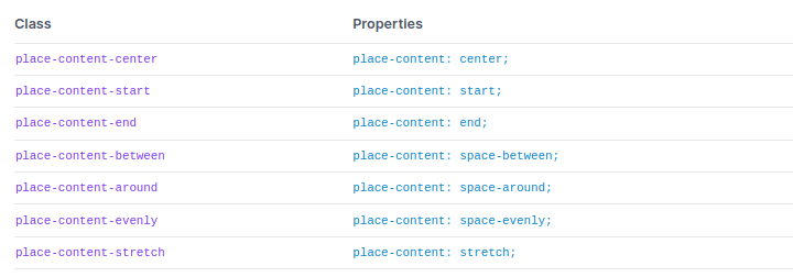
Properties of Place Content:
1. place-content-center:
Place-content-center utility allows to combine items in the center of the block axis:
Code:
<div class="grid grid-cols-3 gap-2 place-content-center h-48 ...">
       <div>1</div>
       <div>2</div>
       <div>3</div>
       <div>4</div>
       <div>5</div>
       <div>6</div>
    </div>
Example:

Note: For more properties like place-content-center, place-content-end, and many – visit Place Content
Place Items
Place Items utility allows controlling the items are justified and aligned simultaneously.

Properties of Place-Items:
1. Start
Place-items-start allows to place grid items on the beginning of their grid areas on both axis:
Code:
<div class="grid grid-cols-3 gap-2 place-items-start h-48 ...">
       <div>1</div>
       <div>2</div>
       <div>3</div>
       <div>4</div>
       <div>5</div>
       <div>6</div>
    </div>
Example:

Note: For more properties like place-items-start, place-items-end, and many – visit Place Items
Place Self
Place Self Utilities allow controlling how a separate item is aligned and justified simultaneously.

Properties of Place-self are as below:
1. Auto
For auto place behaviour, Tailwind CSS offers place-self-auto class to align items based on the value of the container’s place-items property.
Code:
<div class="grid grid-cols-3 gap-2 ...">
       <div>1</div>
       <div class="place-self-auto ...">2</div>
       <div>3</div>
       <div>4</div>
       <div>5</div>
       <div>6</div>
    </div>
Example:

Note: For more properties like place-self-auto, place-self-start, place-self-end and many – visit Place Self
Conclusion
In the last, we went through Flexbox and Grid properties, examples, and many more. It is tough to manage and display all information and examples in one blog; we provided reference links to documentation.
You can bookmark this for better understanding and quick reference. You can use documentation to understand any configuration related changes when you work on any project.
It is recommended to go through each section practically, do practical and bookmark tabs. Also, if you have any questions or need further clarification, feel free to Contact us . Don’t forget to share with friends, colleagues on social media.

